
This graph was created by me in 2002 from Reserve Bank of India data published until 1998.

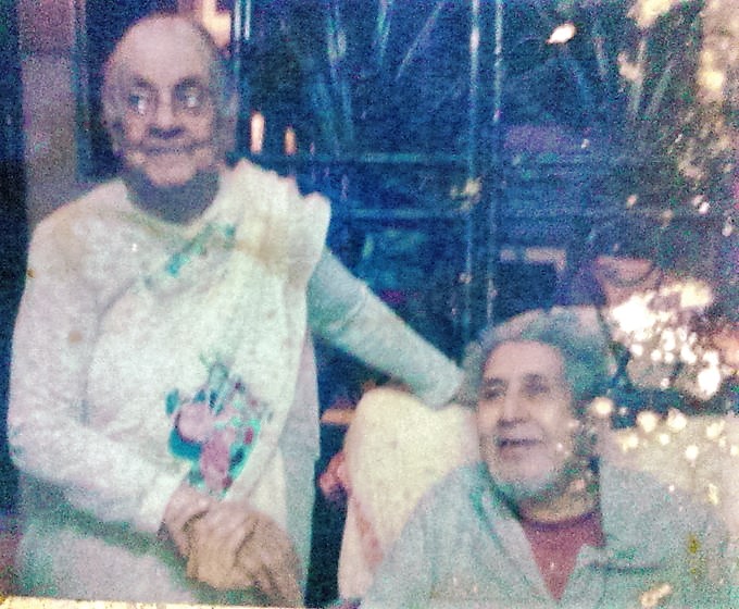
Although I had been “full professor” at the time for six years at something known as an “Institution of National Importance” in India, I had received not a rupee by way of any research-assistance, and had to be assisted in the creation of this graph by two very elderly lay persons, one aged 87 and another aged 77, who read out over many hours (despite frail eyesight) long columns of RBI data which I then typed into an Excel file.
[My Research Assistants about six years after they’d helped me create the graph from RBI data…so the graph deserves to be dubbed the PurnimaMihir Graph].

Leave a comment